Today is tax day in the US. In celebration we’re going to take a look at some of the data available on the IRS Statistics page. Since the current administration focuses a lot of rhetoric on making the “rich pay their fair share,” I thought it might be interesting to see if any of the data made available by the IRS could be used to look at whether or not this is true at the moment. Luckily for us, the IRS makes an Excel sheet available that includes what income percentiles earn what share of taxable income and what portion of the tax burden is born by these same percentiles.
It is important to note that this Excel sheet only reports on what the IRS refers to as “ Adjusted Gross Income,” which is - as the name suggests - gross income after adjustment by tax breaks and the like. While this accounts for capital gains, it does not account for all taxes paid by the population. Consumption taxes, for example sales tax revenue, is not included. State taxes are also excluded from this data set. Nevertheless I think this data set is interesting to look at, and we will note a research paper below that shows this trend continues even after adding in consumption taxes.
Defining a Notion of ‘Fairness’
The question of “fairness” can be viewed as a question of proportion. There are two obvious ways to do this: tax share being proportional to one’s share in the population, or being proportional to one’s share of the income. Let’s use an example to illustrate these two different options. You and two of your friends go out and have dinner together. The total tab amounts to 90 USD. What would be a fair way of splitting that tab?
The simplest option would be to divide the entire bill by the number of people in the group. That way, everybody pays an equal amount regardless of their respective incomes. In this case, everybody would pay 30 USD towards the bill.
A second option would be to make each person’s contribution equal to their ability to provide as measured by their income. Let’s say you have one friend who is currently between jobs, i.e. with no income, and your other friend makes twice what you make. If we wanted to scale by income, your friend between jobs would pay nothing towards the bill, you would pay 30 USD, and your friend with greater income would cover the remaining 60 USD of the bill.
We can expect neither of these two options to be the case with the US tax system, which is decidedly progressive - the more money you earn, the higher a percentage of your income goes towards the federal goverment.1 In my experience, many people actually underestimate how robust the American welfare system is. Blanchet, Chancel and Gethin (2020) for example have shown that the US redistributes a greater share of national income to its low-income population than any European country.2 This paper also shows that the trend in the taxes we find in the IRS data holds after considering additional taxes such as consumption taxes.
Loading the Data
The data we are interested in come in two separate ranges of the Excel sheet. First, we’ll load the XLS file using a temporary object:
filename _httpin temp;

proc http method="get" url="https://www.irs.gov/pub/irs-soi/20in41ts.xls"
		out=_httpin;
run;
We can then use PROC IMPORT with the range option to read the relevant ranges of the Excel sheet that we are interested in. For the AGI share information that is the range given by TAB1$A134:P153. For the tax share, the relevant range is TAB1$A155:P174. Both tables are in wide format and will need transposing. Since the code is nearly identical for both ranges, I wrapped it in a macro function:
%macro get_table(name=, range=);
proc import datafile=_httpin out=&name. dbms=XLS replace;
    range="&range.";
run;

proc transpose data=&name.(drop=B)
    out=&name.(drop=_LABEL_ rename=(Col1=&name.))
    name=ExcelCol;
    by A;
run;
%mend;
We can then easily call this for both the tax share and AGI ranges:
%get_table(name=AGISH, range=TAB1$A134:P153);
%get_table(name=TAXSH, range=TAB1$A155:P174);
One tricky part of this is having to deal with transorming the Excel Column headers into the requisite percentiles. An easy way of doing this is to specify a SAS format that can be applied to the data. Here we go:
proc format;
	invalue coln 'C'=0.00001 'D'=0.0001 'E'=0.001 'F'=0.01 'G'=0.02
                 'H'=0.03 'I'=0.04 'J'=0.05 'K'=0.10 'L'=0.20
                 'M'=0.25 'N'=0.30 'O'=0.40 'P'=0.50;
run;
This can now be used with the input function to relabel our columns as percentiles. At this point we’re ready to merge. Here’s what the 2020 data looks like:
| Year | Top Percentile | Cumulative Tax Share | Cumulative AGI Share |
|---|---|---|---|
| 2020 | 0.001% | 4.143% | 2.379% |
| 2020 | 0.010% | 10.214% | 5.530% |
| 2020 | 0.100% | 22.056% | 11.322% |
| 2020 | 1.000% | 42.313% | 22.187% |
| 2020 | 2.000% | 50.375% | 27.723% |
| 2020 | 3.000% | 55.508% | 31.801% |
| 2020 | 4.000% | 59.495% | 35.171% |
| 2020 | 5.000% | 62.742% | 38.107% |
| 2020 | 10.000% | 73.670% | 49.453% |
| 2020 | 20.000% | 84.929% | 64.869% |
| 2020 | 25.000% | 88.508% | 70.713% |
| 2020 | 30.000% | 91.357% | 75.709% |
| 2020 | 40.000% | 95.334% | 83.734% |
| 2020 | 50.000% | 97.678% | 89.819% |
We see from this table that US taxes are quite progressive. The Top 2% of tax payers pay about half of all the income taxes paid to the federal government, while earning only a quarter of all the taxable income generated. The bottom 50% of tax payers contribute nearly nothing to these federal taxes (less than 3%). We can also see a glimpse of income inequality - nearly half of all income earned is earned by the top 10% of income earners.
Some Visualizations
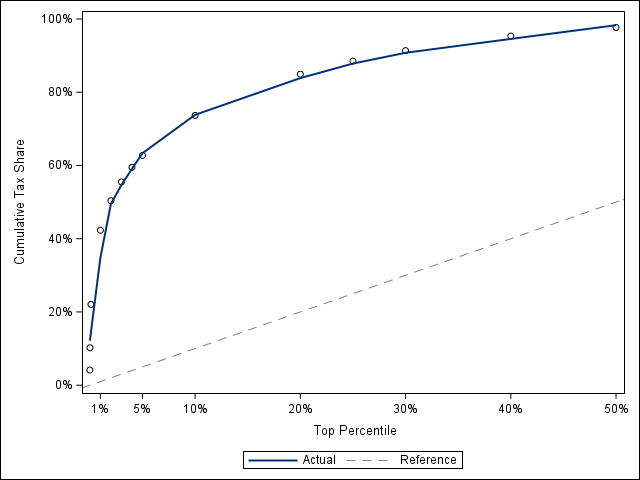
Let’s start by looking at a few simple visualizations of the data. In the following image, the dashed grey line represents equality between the top income percentiles (x-axis) and the cumulative tax share (y-axis). Anything above the line indicates larger-than-proportional contributions.

This graph basically looks as expected. We can see three distinct slopes in the graph: the steepest section is for the top 1% of tax payers. The next part is the 2-5% range, and then the 10-50% range is likewise fairly consistent.
We can use this graph to calculate something akin to a Gini coefficient. The Gini coefficient represents the ratio of the area under the Lorenz curve compared to the area under the equality line, which would represent perfect equality between the cumulative population share versus cumulative share of income. A Gini coefficient of zero would imply perfect equality, while a Gini coefficient of one would imply perfect inequality.
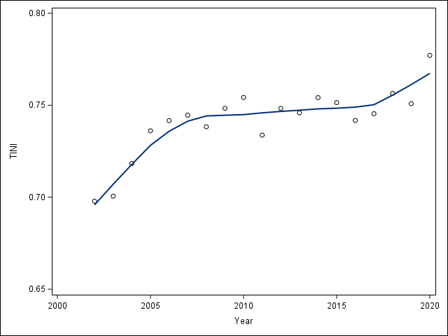
We don’t have the full population size, so our coefficient won’t be completely comparable. We will define our tax GINI coefficient, let’s call it “TINI” coefficient, as the ratio of the area between the cumulative Tax Share and the equality line to the total area above the equality line on the box $(0,0.5)\times(0,1)$. The total area above the equality line is $3/8$. We can run through this with a data step using a trapezoidal approximation. See the accompanying SAS script for details.

This TINI coefficient is centered at 0.74 over the data period. While quite stable from about 2008 to 2016, the overall trend has been upwards towards greater inequality. Compare this to the US' Gini coefficient which has fluctuated around 0.4 during that same time period. From this, it would appear that the inequality is greater when looking at tax contributions than wealth distribution.
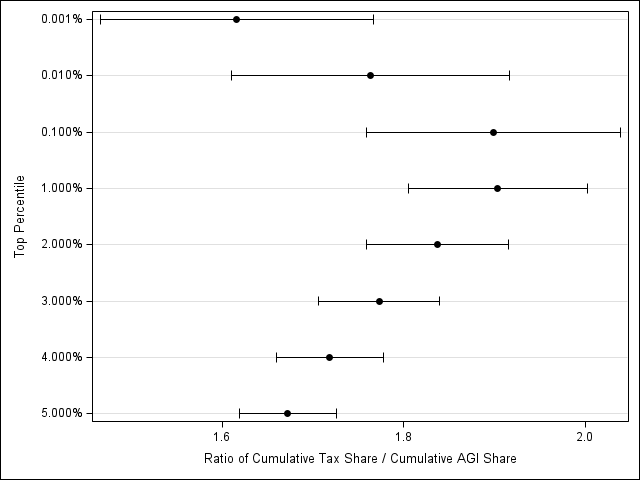
Another interesting way to look at this data is to think about the ratio of cumulative share of taxes paid over the cumulative share of AGI earned by the different percentiles. For the top 5% of earners, this ratio tends to hover between 1.6 and 1.9 over the data period as can be seen from the plot below.

Even though I expected to see some inequality due to the progressive nature of the tax system, I was surprised by how “top-heavy” the tax burden is given the popular rhetoric.
-
See this IRS for a marginal rates for the 2023 tax year. In this year, the rates range from a low of 10% to a high of 37%. ↩︎
-
Blanchet, T., Chancel, L., and Gethin, A. (2020), “Why Is Europe More Equal than the United States?”, American Economic Journal: Applied Economics, 14 (4), 450–518. DOI: 10.1257/app.20200703. ↩︎